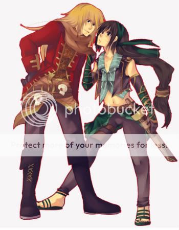
Name: Nevulti
Creativity: 8
Theme: 10
Matching: 8
total: 26/30
Comment:Love how you got shape and all the color you use. Need more yellow and the blue in the sleeve that stand out too much.
Name razz olarmints
Creativity: 10
Theme: 7
Matching:7
total: 24/30
Comment: It really does get the feel of all the google picture. Tough it still kinda hard to tell it a tulip. I love how hard you try to match all the color.
Name:Hath September
Creativity: 6
Theme: 6
Matching:10
total: 22/30
Comment:You just use the flower color because I can't see the flower shape at all. Still the avi look great overall.
Name: `April
Creativity: 6
Theme: 6
Matching:10
total: 22/30
Comment:The flower isn't all pink and I didn't get the shape from this avi. Love how well the pink color match though.
Name:Greivous Bodily Harm
Creativity: 8
Theme: 8
Matching: 8
total:24/30
Comment: Look so much like the flower tough the shape isn't entirely there.
FlurpleDino
Here I go ~
Name:Nevulti
Creativity: 10/10
Theme: 10/10
Matching:9/10
total: 29/30
Comment: Everything was pretty much perfect, When I googled it my whole face went ":O!!" the only thing was that you put in the blue in the arms, but you didn't put it anywhere else.. that would kinda be it.
Name razz olarmints
Creativity: 9/10
Theme: 8/10
Matching:8/10
total: 25/30
Comment: Sure the shake of the avi seemed taller but not graceful like a tulip, and it was a little bit too cluttered and out of hand in the torso I could also feel different colours in there that didn't match the pink-white-yellow-red-purple theme.
Name:Hath September
Creativity: 8/10
Theme: 8/10
Matching:7/10
total: 23/30
Comment: When I googled tulips it normally wasn't just a plain old simple yellow and white flower, you're avi is just simply two colours when in the pictures it seemed more lively than that, you missed the red colour which would've made it look much better and the form of the avatar is like it's upside down or something ~ o.O, Also I do not get why the whiskers of the avatar are on daffodil's face.
Name:`April
Creativity: 9/10
Theme: 7/10
Matching:7/10
total: 23/30
Comment: You focused too much on one image instead of expanding into various flowers, smart move to put the skirt that kind of resembles the petals on dahlia's but - other than that to me it didn't resemble Dahlia's at all.
Name:Greivous Bodily Harm
Creativity: 10/10
Theme: 10/10
Matching:10/10
total: 30/30
Comment: This was PERFECT! O_O.. you giving it those wings was a very smart move, you made it look graceful; resembling a flower. Also incluiding so many shades of orange gives it an expansion so you not only managed to capture one picture of a tiger lily, but a ton of images were bunched together to make it look like one.. enough of my rambling, GOOD JOB!(:
- - c h o c - OH - rawrr
Sorry I'm late ! Totally forgot about this.
Contestant: Nevulti
Scale: 8/1O
Creativity: 8/1O
Theme: 8.5/1O
Matching: 8/1O
Total: 32.5/4O
Comment: I like the use of the iris corset and how well you matched the colours. The only thing really that bugs me is the feet.
Contestant: PolarMints
Scale: 6.5/1O
Creativity: 8/1O
Theme: 7.5/1O
Matching: 6/1O
Total: 28/4O
Comment: It looks like it's split into three parts, because of the colours are not spread out properly. Doesn't really remind me of a tulip.
Contestant: Hath September
Scale: 7.5/1O
Creativity: 8/1O
Theme: 7.5/1O
Matching: 7.5/1O
Total: 3O.5/4O
Comment: I think you should have used a more vibrant, bright yellow, with some orange as well. Most daffodils don't have that much white.
Contestant: `April
Scale: 6.5/1O
Creativity: 7/1O
Theme: 7/1O
Matching: 7.5/1O
Total: 28/4O
Comment: It's too pink and plain. You could've made it more round or something, since most of them look round and fluffy.
Contestant: Greivous Bodily Harm
Scale: 7.5/1O
Creativity: 8.5/1O
Theme: 9/1O
Matching: 8/1O
Total: 33/4O
Comment: I love this colour scheme. Could have used some orange on the head. It's a little simple, but that suits the flower.


