|
|
|
|
|
|
|
 Posted: Sat Jul 02, 2016 11:56 am Posted: Sat Jul 02, 2016 11:56 am
|
|
|
|
|
|
|
|
|
|
 Posted: Sat Jul 02, 2016 12:08 pm Posted: Sat Jul 02, 2016 12:08 pm
|
|
|
|
|
|
|
|
|
|
|
|
|
 Posted: Sat Jul 02, 2016 3:53 pm Posted: Sat Jul 02, 2016 3:53 pm
Zphal Alrighty. Also, ooooooh my eyes are really drawn to the image in your siggy. surprised Haha, thanks smile
|
 |
 |
|
|
|
|
|
|
|
|
|
|
|
|
 Posted: Sun Jul 03, 2016 9:02 pm Posted: Sun Jul 03, 2016 9:02 pm
I prefer Option #1, it just appeals more to m than Option #2. I hope this helps! Good luck on your future projects! ^.^
|
 |
 |
|
|
|
|
|
|
|
|
|
|
|
|
|
|
|
 Posted: Mon Jul 04, 2016 7:39 am Posted: Mon Jul 04, 2016 7:39 am
Both look good. but if u want to spend less time, go with the first one, more time, go with the second one
|
 |
 |
|
|
|
|
|
|
|
|
|
|
|
|
 Posted: Tue Jul 05, 2016 12:55 pm Posted: Tue Jul 05, 2016 12:55 pm
I ultimately voted for the second design but there's aspects that I like about the first design (like one star per section rather than the two). On it's own, I like the white star in the middle but when taking into consideration that this is going to be a tree skirt, that star may not look as nice or even be seen when covered with presents; so the plain white middle will work better.
In the end, it just matters on how much work you want to do in making this tree skirt.
|
 |
 |
|
|
|
|
|
|
|
|
|
|
|
|
|
|
|
 Posted: Fri Jul 08, 2016 12:16 pm Posted: Fri Jul 08, 2016 12:16 pm
i like the top one because it is more angular and reminds me of the traditional Amish quilts we love.
the lower one reminds me more of those video games with jewels?
|
 |
 |
|
|
|
|
|
|
|
|
|
|
|
|
 Posted: Fri Jul 08, 2016 2:05 pm Posted: Fri Jul 08, 2016 2:05 pm
i voted with the majority
yes, that is the coward's way out
|
 |
 |
|
|
|
|
|
|
|
|
|
|
|
|
|
|
|
 Posted: Mon Jul 11, 2016 11:59 am Posted: Mon Jul 11, 2016 11:59 am
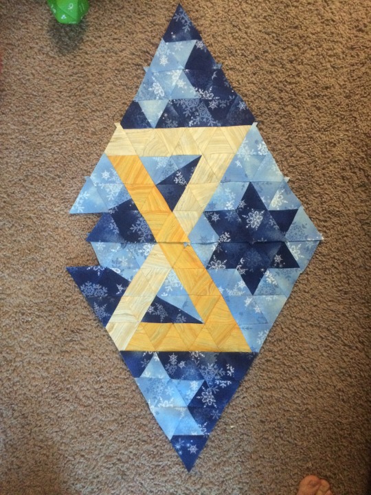
Zphal  Progress! Looking good so far!
|
 |
 |
|
|
|
|
|
|
|
|
|
|
|
|
 Posted: Tue Jul 12, 2016 11:07 am Posted: Tue Jul 12, 2016 11:07 am
I like the first one, it is very nice but the second is a little cleaner in the design if you could take the attributes of the first one and combine it with the cleanliness of the second it would be absolutely perfect heart
|
 |
 |
|
|
|
|
|
|
|
|
|
|
|
|
|
|
|
 Posted: Tue Jul 12, 2016 2:19 pm Posted: Tue Jul 12, 2016 2:19 pm
Prof. Moonie Zphal  Progress! Looking good so far! It's actually almost done now; I'll have to post pics. xd
|
 |
 |
|
|
|
|
|
|
|
|
|
|
|
|
 Posted: Fri Jul 15, 2016 10:59 am Posted: Fri Jul 15, 2016 10:59 am
I like the second the first one star is big if the two could meet in the middle it will be perfect.
|
 |
 |
|
|
|
|
|
|
|
|
|
|
|
|
|
|
|
 Posted: Fri Jul 22, 2016 2:49 pm Posted: Fri Jul 22, 2016 2:49 pm
The first one, the second feels not quite lacking, but the space for the center is not quite equal or equivalent in a way
|
 |
 |
|
|
|
|
|
|
|
|
|
|
|
|
 Posted: Tue Jul 26, 2016 11:04 am Posted: Tue Jul 26, 2016 11:04 am
I like the second one. Looks cleaner and less cluttered imo.
|
 |
 |
|
|
|
|
|
|
|
|
|
|
|
|
|
|
|
 Posted: Sat Aug 06, 2016 12:30 pm Posted: Sat Aug 06, 2016 12:30 pm
|
|
|
|
|
|
 |
|
|

