


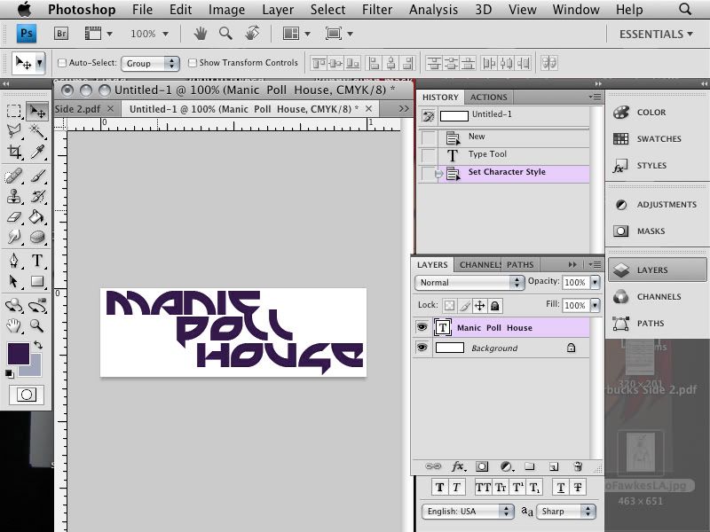
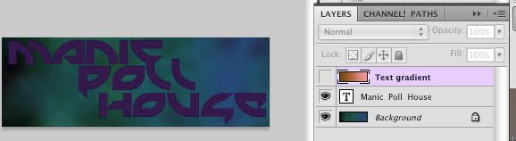
and this is what the layout of my screen looks like:
My document is 500x300 pixels. You don't need to have it exact, or really follow what I do exactly. You get better at photoshop by just messing around, but you need to know starter possibilities to get more and more advanced and then you're the genius writing script and making awesome amazing things that take hours to render.
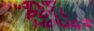
Obviously MPH is awesome so I'm making a banner. I used a purple font in Mercenary, though that doesn't really matter. A more blocky font would be best to get the feel of this thinger.
layer-> new layer (or Shift command N)
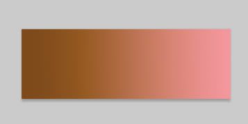
did a gradient fill of dark orange and pink in new layer
This is where Layer Styles come in.
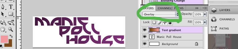
With the Gradient layer selected, change the layer style from normal to overlay
And the text is now cool gradient, and the gradient can be changed and the world is lovely.
Alas the background is boring. So Choosing the foreground color and background colors as blue and green, I go to filter->Render->Difference clouds
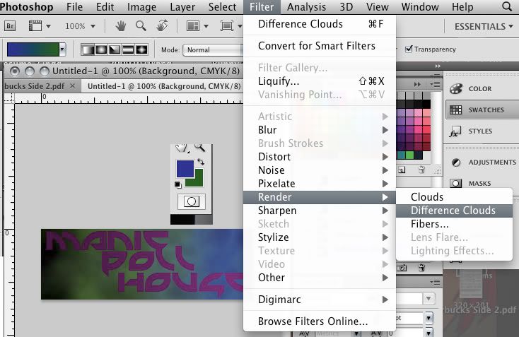 I kept on clicking this (or command F) until I got this nice gradient. effect
But wait, is that gradient because of the gradient layer?
Why yes it is! but it sill looks snazzy without the gradient layer, but then the text would be less cool- oh whatever are we to do?!
Select the layer with type, right click and choose to rasterize type (This converts it from a mathematical image creation that will re-size smoothly to a pixel image creation)
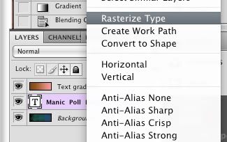
Then while still in this layer, using the magic want, ensuring that the Contiguous box is unchecked above, select some place that is not type, and poof! all that is not type is selected!
Then go to the gradient layer and either cut/delete, or create a mask layer. Because I know I am not moving that type, I am cutting.
to have fewer layers to work with and because I know I'm not changing the type or gradient layer, right click the gradient layer and click merge down.
There. That is lovely, now isn't it. Lets mess up this tranquility by making a new layer and filling it with a color. It doesn't matter which color, just needs to be a color.
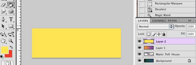
I chose yellow and set my background color to an orange.
And recall the rendering difference clouds? same thing, but this time render fibers
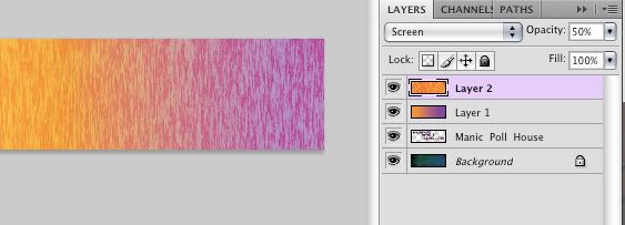
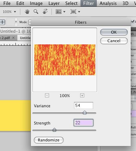 And mess with the controls until you get a texture you want... or hit randomize
back to the layers, change the layer style to screen, and shift the opacity down to about 50% because we don't like white all that much in this design... at least not yet.
Ok, now something I actually learned in school and had never encountered anywhere else, but it creates some nice effects sometimes and why not use it now:
So in the box with layers is Chanels. click that
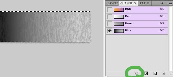 Uncheck the red and the green (it will be different in cmyk mode, but same principles) or whatever gives you the most interesting texture. Click the "load chanel selection" circle button, and paste in new layer
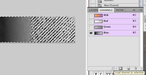
uncheck the old fiber layer and enjoy this nice new translucent layer
Ahhh too bright- and orderly- need more grunge and chaos
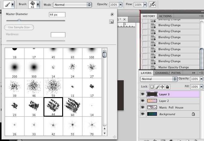
make a new layer and using an art brush (there should be various brush styles that come with your program, but more can be downloaded or if you are so inclined, created) And mark up the new layer in neutral tones. Mess arround with the flow of the brush until a nice streaky look is formed.
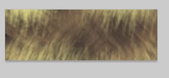
Change the layer style to hard light
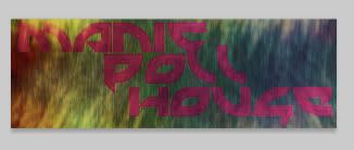
Ah yes, much better, but not enough- needs clutter.
So using some brush stamps I've downloaded- though you can draw some little things; just keep them simple, I made white feathers fall all about, obscuring the letters
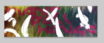
But people like to read banners... or at least have banners that are readable
So change it to screen with an opacity of 24%
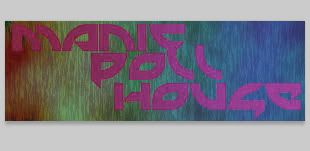
And done:
Ok, so as a banner it sucks, but you get the idea. Play areound with styles and layers and opacities and you will get beauty