- by cleolvtempus |
- Painting And Drawing
- | Submitted on 07/20/2008 |
- Skip
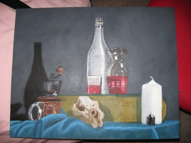
- Title: Still Life
- Artist: cleolvtempus
-
Description:
A still life that I had to do for my Grade 12 Painting class. it was the second painting i had ever done, the first was a practice for this assignment lol. It took about a month of classes and around 12 hours spent after school if not more. the skull and table cloth were the hardest to do. Its acrylic so every day I had to attempt at remaking the same colours *sigh* it was frustrating!! anyways i love the way it turned out and i hope you all do to ^_^
Keep up the faith
Cleopatra LV Tempus - Date: 07/20/2008
- Tags:
- Report Post
Comments (7 Comments)
- Graceful Assassin Sakura - 09/10/2008
-
its beautiful
- Report As Spam
- Selchis - 09/10/2008
- I love how you did the glass. It's very realistic. And the skull is so interesting to look at.
- Report As Spam
- MossNoth - 09/09/2008
- Wow. This is excellent work, for an amateur. My eyes are drawn to the candles more than anything else in the picture.
- Report As Spam
- Chuklez_J4L - 07/24/2008
-
wow
///_O - Report As Spam
- Twilight Neume - 07/21/2008
- wow, that is one of the most amazing paintings I've ever seen. The glasses are very well done as well as everything else. The time you spent doing this definitely shows. Excellent work, you have inspired me to work harder on any painting I do in the future. (5/5)
- Report As Spam
- Yuki Nashi - 07/20/2008
-
POSTIVES of this painting.
ur glasses are VERY well done, especially the glass with the red patterns. I love that. u've captured the light and I feel as if I can pick it out right from the painting. The candles are also well done, especially the black one. The shadows are also well done, except it doesn't match the real bottle because it's too round. The cloth is well done!
This is a great painting since it's ur second one. Keep practicing!!
4.7/5 (five stars rounded up) - Report As Spam
- Yuki Nashi - 07/20/2008
-
I'm being constructive so...
The tall bottle is kind of crooked. ...and ur background should have a dark from the edges to a lighter middle, even if that's not what it looked like in real life. u should still do this or else the background is bland. ur middle thing is unidentifiable and is kinda not 3D enough. - Report As Spam


