- by the view to a kill |
- Painting And Drawing
- | Submitted on 11/02/2008 |
- Skip
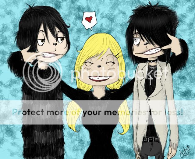
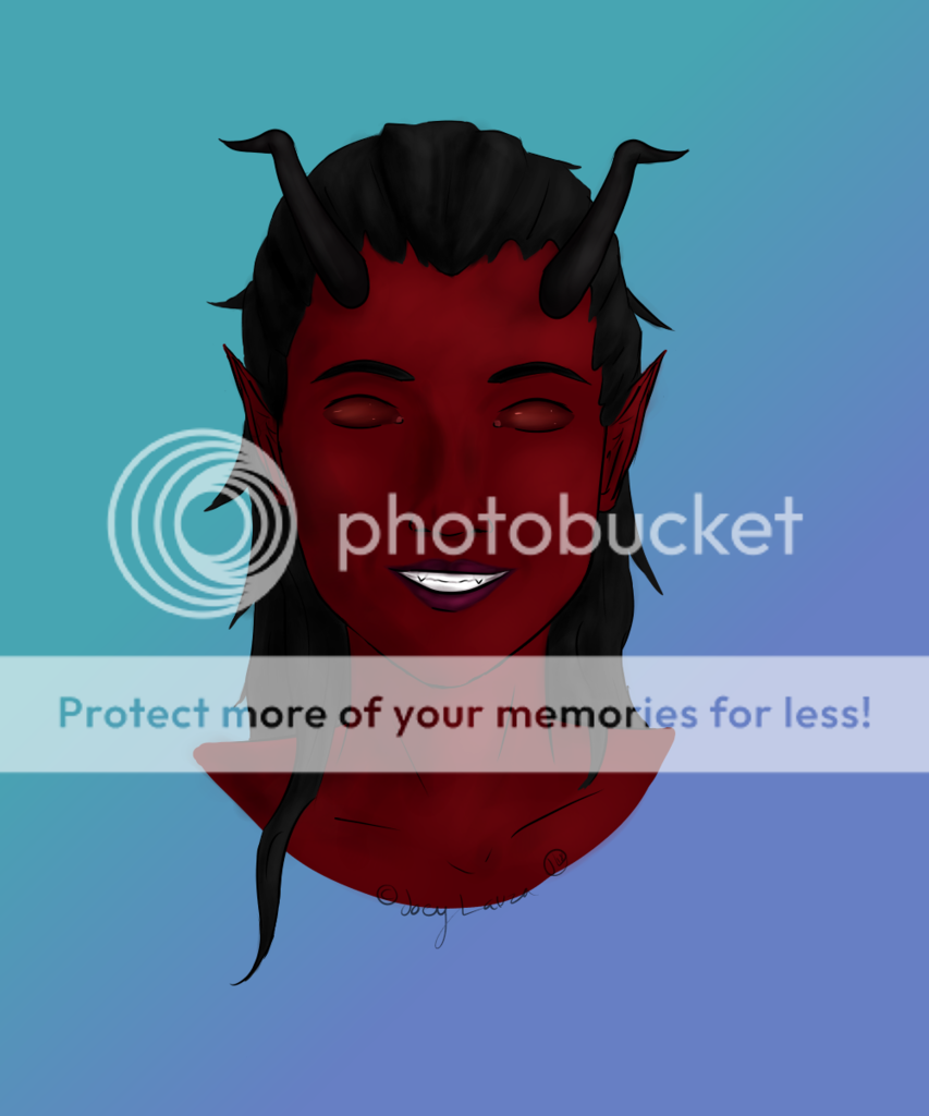
- Title: Smile
- Artist: the view to a kill
-
Description:
>w< I hate this pic so much >.<
I was practicing my eyes, and decided I wanted ears, and then from there, I decided I wawnted to color it a bit strange- idk if i got carried away with it =_=;
please comment honestly, and at least TRY to enjoy my mediocreness-lol
i did the lines in a sketchbook with sakura line g pen (size 03 ) and colored it on photoshop elements! <3
~mi - Date: 11/02/2008
- Tags: smile mihappyou
- Report Post
Comments (7 Comments)
- gffffffffffffffffffffffff - 11/02/2008
- this is really wierd looking- her eyes are good, and so is the coloring, but it feels a bit unbalanced- idk good job though 2/5
- Report As Spam
- the view to a kill - 11/02/2008
-
>///< ouchie! lol!! thankyou so much for looking!! >w<
~mi - Report As Spam
- emo bunny at the mall - 11/02/2008
-
•pinches cheecks•
chubby cheecks! - Report As Spam
- the view to a kill - 11/02/2008
-
o.o thankyou so much! <3
~mi - Report As Spam
- little_dark_dream - 11/02/2008
- i love it!!!!!! XD
- Report As Spam
- the view to a kill - 11/02/2008
-
thankyou very much!!! <3 I will work hard to improve!!! >w<
~mi - Report As Spam
- Starlight Illusion - 11/02/2008
- You could have put more effort into the hair. The angle the head is at does not warrant that much of a contrast in the size from that perspective, either. It is not that extreme of an angle, so the nose should be back near the center of the face, especially since the lips are there. The left eye (from where I'm looking) is far too small. The face is kind of bulging out of the hair, too. You should work for a more natural curve as the head slopes out into the nose and chin.
- Report As Spam


