- by sora_of_darkend_souls |
- Painting And Drawing
- | Submitted on 10/14/2009 |
- Skip
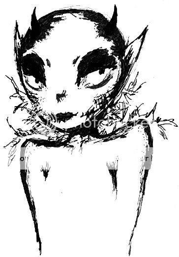
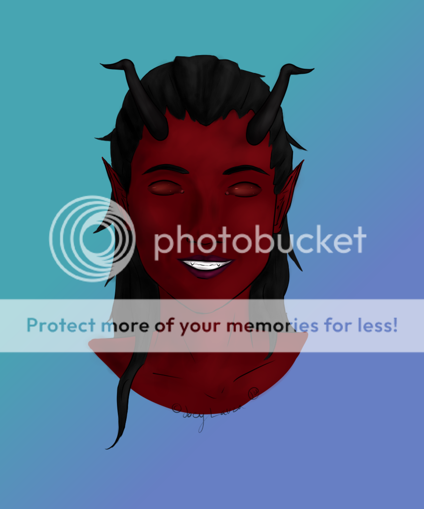
- Title: Luna (got idea form bleach)
- Artist: sora_of_darkend_souls
- Description: I was bored wacthing bleach one day and got her in my head....hope u like
- Date: 10/14/2009
- Tags: luna idea form bleach
- Report Post
Comments (7 Comments)
- Allester BloodFire - 07/10/2011
- I like it my advice is for you to work on shadowing Unlike some other posts The proportions aren't bad especialy since you aren't doing realism. So yeah, work on your shadows and highlights very basic and very important and makes things pop out
- Report As Spam
- Mrs Miffy - 06/12/2010
-
The girl's shoulder are very stiffened, kind of like a mans.
Its a very graceful idea, make the shoulders less stiff and skinnier to make her look more female.
And learn to accept feedback, if you want to get any better you have to agree and work on it, like Havoc at the rave said.
And the eyes are out of proportion, FYI. - Report As Spam
- Gridlock in Paradise - 06/09/2010
-
Gotta admit, the proportions are off. Face is too small, I don't really understand how the arms are supposed to be. Lacking in detail. The concept however is good.
PS, if you're gonna submit in the art arenas, expect to get criticism. Take what your audience says to heart and use it to improve your skills. - Report As Spam
- sora_of_darkend_souls - 10/20/2009
-
Shes whereing a dress and her proportions are fine dumbasses the scanner messed her up alittle bit god
only nice comments please - Report As Spam
- hteb - 10/18/2009
-
Three word.
Out of proportion. - Report As Spam
- Music-faery-for-comfort - 10/16/2009
- nice design, good ideas, keep on drawing!
- Report As Spam
- Every_day118 - 10/16/2009
- nice :3
- Report As Spam


