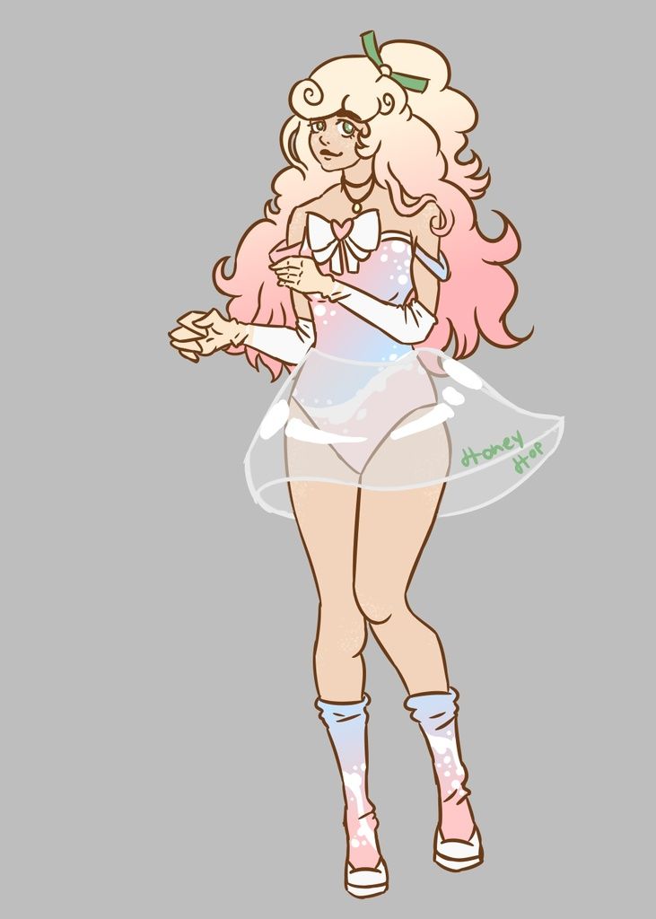
- Title: poofy dress
- Artist: crumcrum
- Description: i got the inspiration while in my aunts basement looking at the ceramic dolls she had. i outlined it with an ink pen and colored it with prisma colors
- Date: 07/06/2009
- Tags: poofy dress
- Report Post
Comments (7 Comments)
- davemi - 07/08/2009
-
this is really good
- Report As Spam
- Phantom-of_Winter - 07/08/2009
-
-continuation-
really give evidence that there is a floor underneath her (and also to pop her out more). It would also be nice if you exposed one of her legs to show that she has feet.
In all, and ending my long critique, you need to give other things form too and not just the main parts that catches the eye. But also, you have a nice use of contrast and you're really good at a simple dress design.
3/5 - Report As Spam
- Phantom-of_Winter - 07/08/2009
-
-continuation-
highlights and shadows, which is good to get the drawing to pop out, but then you stopped at the white cloth of the dress. I suggest using a light blue as the shadow and lighten up the white for the highlights. Also, put a little more shine in the eyes and hair (unless, the camera/scanner dulled out the color of the drawing). Also the character's necklace is plain, color wise (you should defintely use some highlights in that). And also maybe add a shadow under the character to - Report As Spam
- Phantom-of_Winter - 07/08/2009
- This is really good, I like how you did the folds on the dress. And like two people had already mentioned, the left side of the dress loos a little funky. But that isn't all; one of her hands looks a lot fatter than the other. Her neck might be a little too thick (thin it out and curve it a little). Her chest... seems a little weird... and her chin is somewhat visible but not all of the way (try to curve it out). Her eye farther away looks a little funky as well. And I see you tried to use
- Report As Spam
- artist_lily - 07/07/2009
- its good but the same thing about that left part
- Report As Spam
- The Devil Ate My Cookie - 07/07/2009
- i likey the dress XD
- Report As Spam
- gesumin - 07/06/2009
-
I really like all the folds, and you did pretty good with the satiny effect
The left side of her skirt looks a little weird, but that's the only part of it that's bugging me. Good job! - Report As Spam


