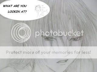
- Title: Go Away
- Artist: Yum Yum
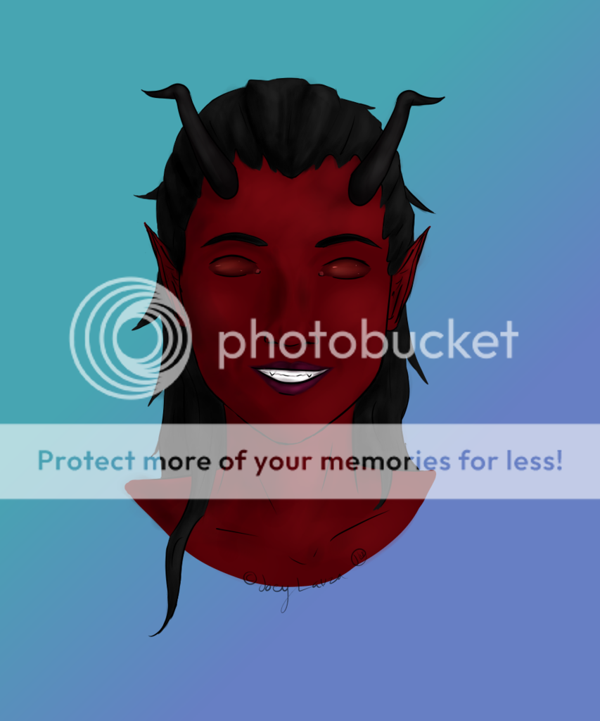
- Description: This started out as a joke, but I got enough requests to make it an actual image and so that's why this picture exists. Backgrounds I have no interest for but the one in this image is modified from a photo, except for the red thing, which is my weak attempt at making interesting scenery. Plus the coloring is intentionaly sketchy, it was colored smoothly at first but I didn't like how it looked so I decided to make it look a bit messier.
- Date: 02/22/2004
- Tags: vampirehunterd
- Report Post
Comments (7 Comments)
- Sellesion - 07/27/2010
-
I really like the hair and the face, but the rest just isn't my sorta thing. It's alright, but I'm not really fond of it. I think it's because the shape of his body looks sharp, and jagged, so along with the sketchy-ness, and the kinda odd shading, It just looks so.... unfinished, and messy. I've seen really good pictures that are sketchy/rough... anyways, good job. 4/5
Look at my art please? - Report As Spam
- SweetTearsOfABrokenSorrow - 01/18/2010
- well that is different. O.O
- Report As Spam
- MintyGuts - 07/12/2009
-
D:
this scared the frikkin crap outta me...
- Report As Spam
- white tigers223 - 05/28/2009
- Very nice I love it.
- Report As Spam
- IcyDragonWater - 05/28/2009
- cool
- Report As Spam
- tigerdragonqueen - 09/20/2008
- So funny
- Report As Spam
- -Dakudda- - 08/24/2008
-
try and talk about exactly what you like about the
picture; is it the hair? the eyes? the
background?
if you are critiquing, start with
something you like about the picture, then mention
specifically what you don't like. (eg. the hair is
too long, eyes are too big). - Report As Spam


