- by bitesnoobs withgrunyteath |
- Comics
- | Submitted on 01/05/2009 |
- Skip
- Title: (please read all discription)
- Artist: bitesnoobs withgrunyteath
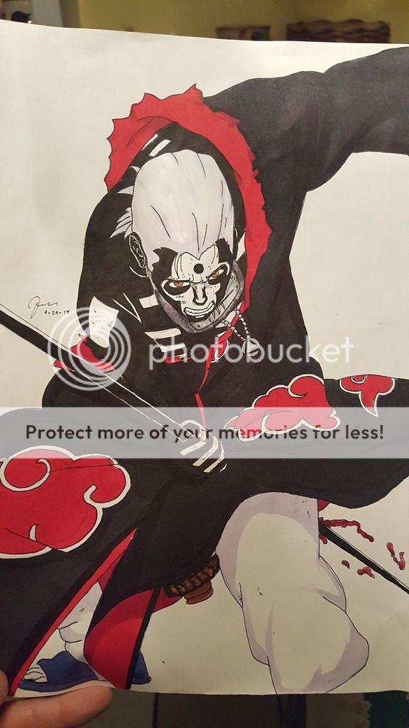
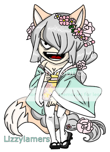
- Description: this is kurotsuchi ueda the main character of the manga i will be posting soon, the sword she is holding is momoko tsubaki, kuro's nick name is "the moons sentless flower" this is just a rough draft and it's on lined paper, so please don't make any comments about that.
- Date: 01/05/2009
- Tags: please read discription
- Report Post
Comments (7 Comments)
- Varun Stunner - 02/13/2009
- try not to do any mistakes tyr your best because the picture shuld always be interesting and im not trying to dicourage you at all next time maybe u could draw a different pic and the we could see if the other one is better then this one then ill rate u
- Report As Spam
- Varun Stunner - 02/13/2009
- i didnt understand the picture but try to put more detail in it so it looks better and so i can understand whats happening so i would give u a 3/5
- Report As Spam
- Pewei - 01/24/2009
- I really like it. Good Job.
- Report As Spam
- Freaken Frisky - 01/10/2009
-
^ ^
thats cool! - Report As Spam
- devastatingtruth - 01/05/2009
-
It is the little details that will make a big difference in the end. I don’t say these things to flame or discourage you, but rather I am giving you this mini-critique based on my own honest opinion. I am pointing out these things so that you can improve and hopefully in the future you will not do the same errors. Good luck with your comic.
[[3of3]]
Sorry for the long multi-comments... I had a lot to say. biggrin - Report As Spam
- devastatingtruth - 01/05/2009
-
Take some time to draw actual people to get down a bit more of the structure/ proportions. She looks extremely lanky and her arms proportionately would not fit her body (if you stretched them out and lined it up with the rest of her torso). Her face looks off in terms of centering. Also try not to hide the hands, if you are not really good at drawing hands, then perhaps that is one other aspect you should practice some more on before you start a comic.
[[2of3]]
- Report As Spam
- devastatingtruth - 01/05/2009
-
I will ignore that it is on lined paper. In the future though, it would be good practice to just use blank paper.
That a side, why would you post it if it is just a rough draft?
Based on what I see, your work looks rushed; this is based on the rough line work. It looks too shaky and I know that is not an aesthetic quality that you are going for. For all I know you could have spent a really long time on it, but that does not come out in the end product.
[[1of3]]
- Report As Spam


